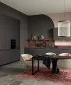
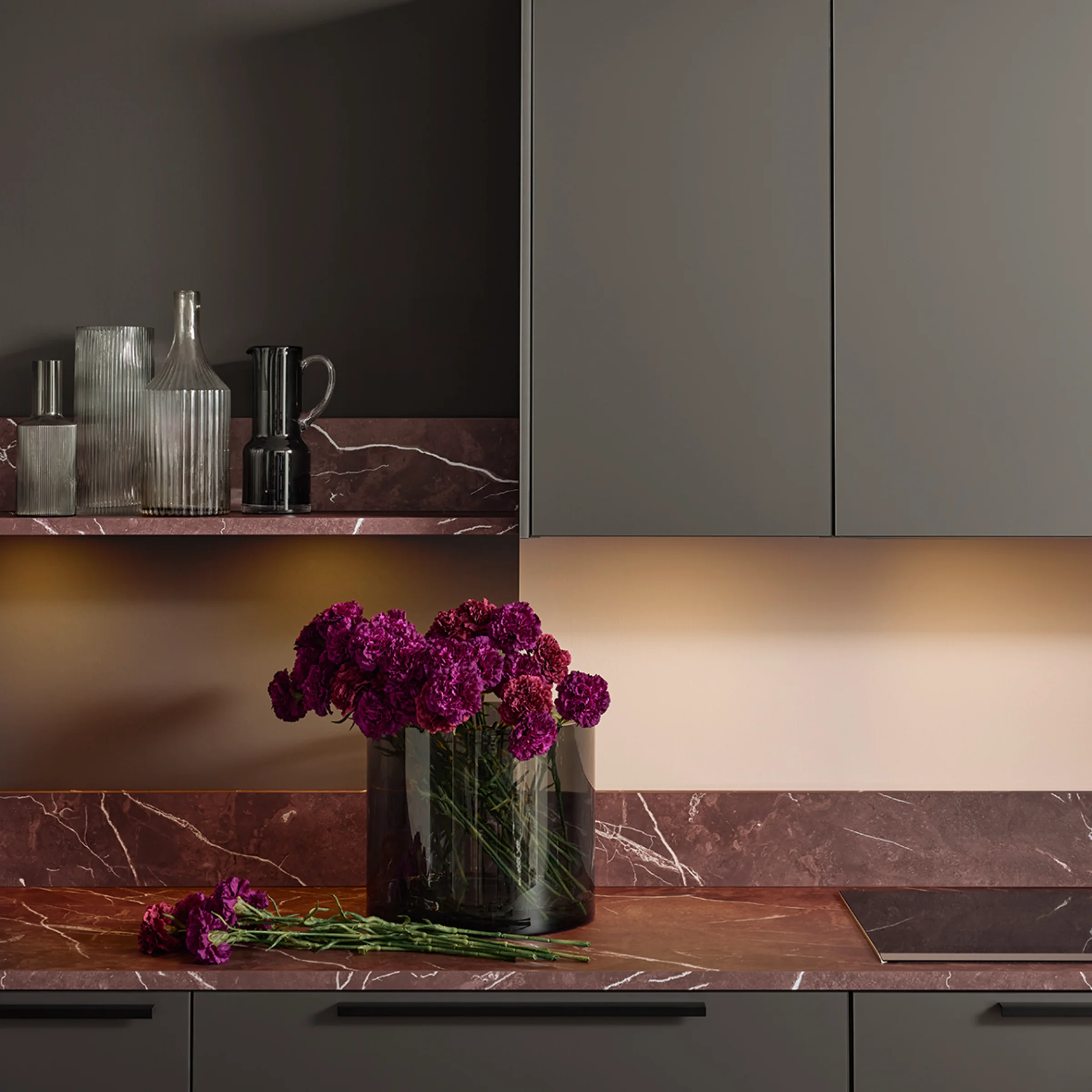
Tone-on-tone kitchen colors

Tone-on-tone is a design concept in which colours, materials and surfaces are deliberately coordinated. Instead of strong contrasts, a calm and harmonious overall look is created that visually connects the kitchen and living space. This approach goes beyond the choice of kitchen fronts and focuses on the interplay between furniture, wall colours and details.
This article shows how the tone-on-tone look can be implemented both in kitchen planning and in existing living spaces, using practical design ideas and tips. The matt lacquer concept from Nolte Küchen offers an additional way to implement tone-on-tone particularly consistently – with perfectly coordinated colours for kitchens, walls and handles.
What does tone-on-tone mean in kitchen design?
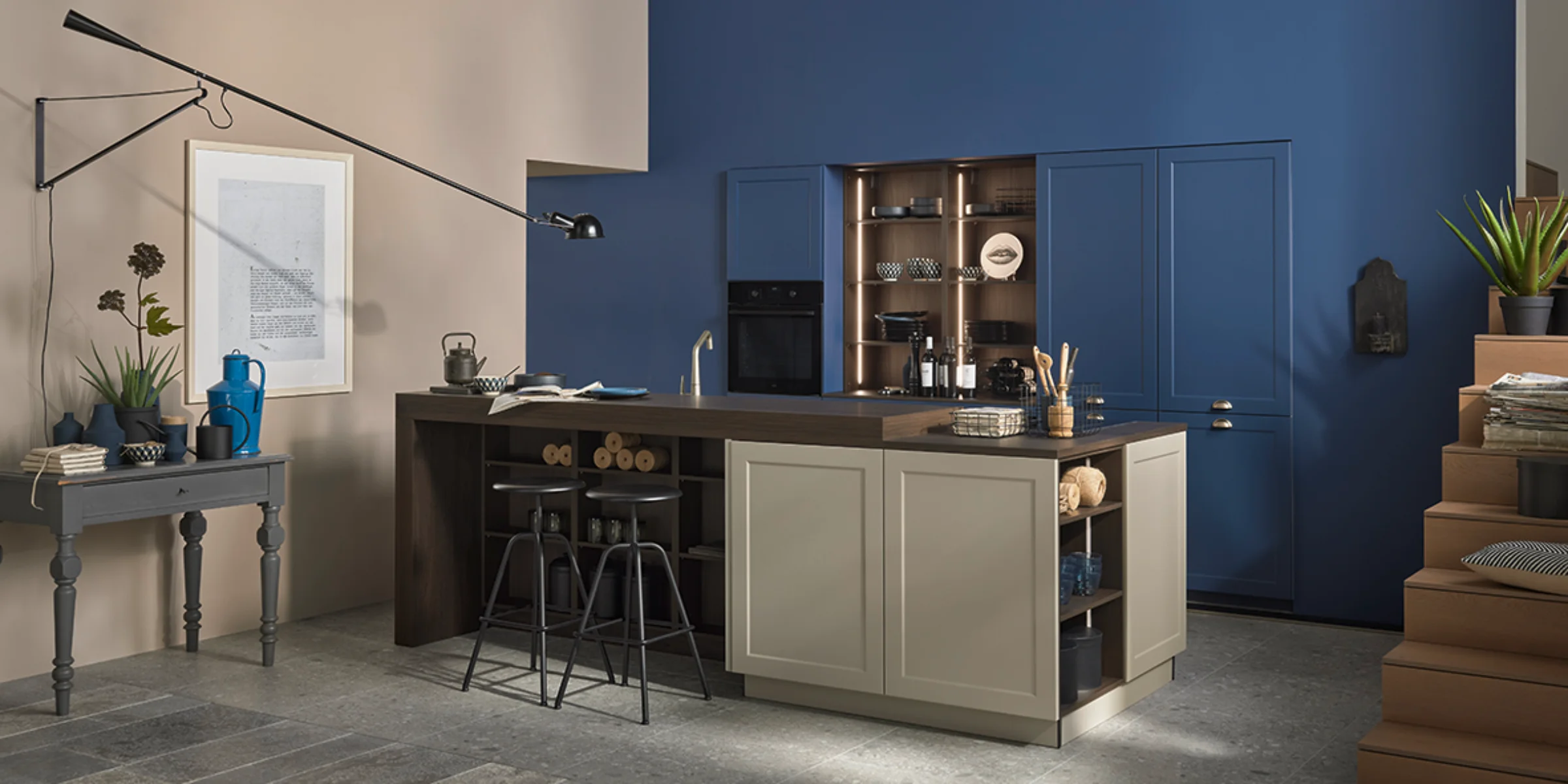
The tone-on-tone concept combines different shades of a color rather than creating strong contrasts. This creates a calm, high-quality overall look. Tone-on-tone creates a smooth transition between the kitchen and living area, especially in open-plan kitchens.
Typical features of tone-on-tone kitchens:
- Kitchen fronts and wall colors from the same color family
- Subtle shades instead of stark contrasts
- Uniform, calm appearance

Planning a tone-on-tone kitchen: coordinating furniture, walls, and details
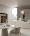
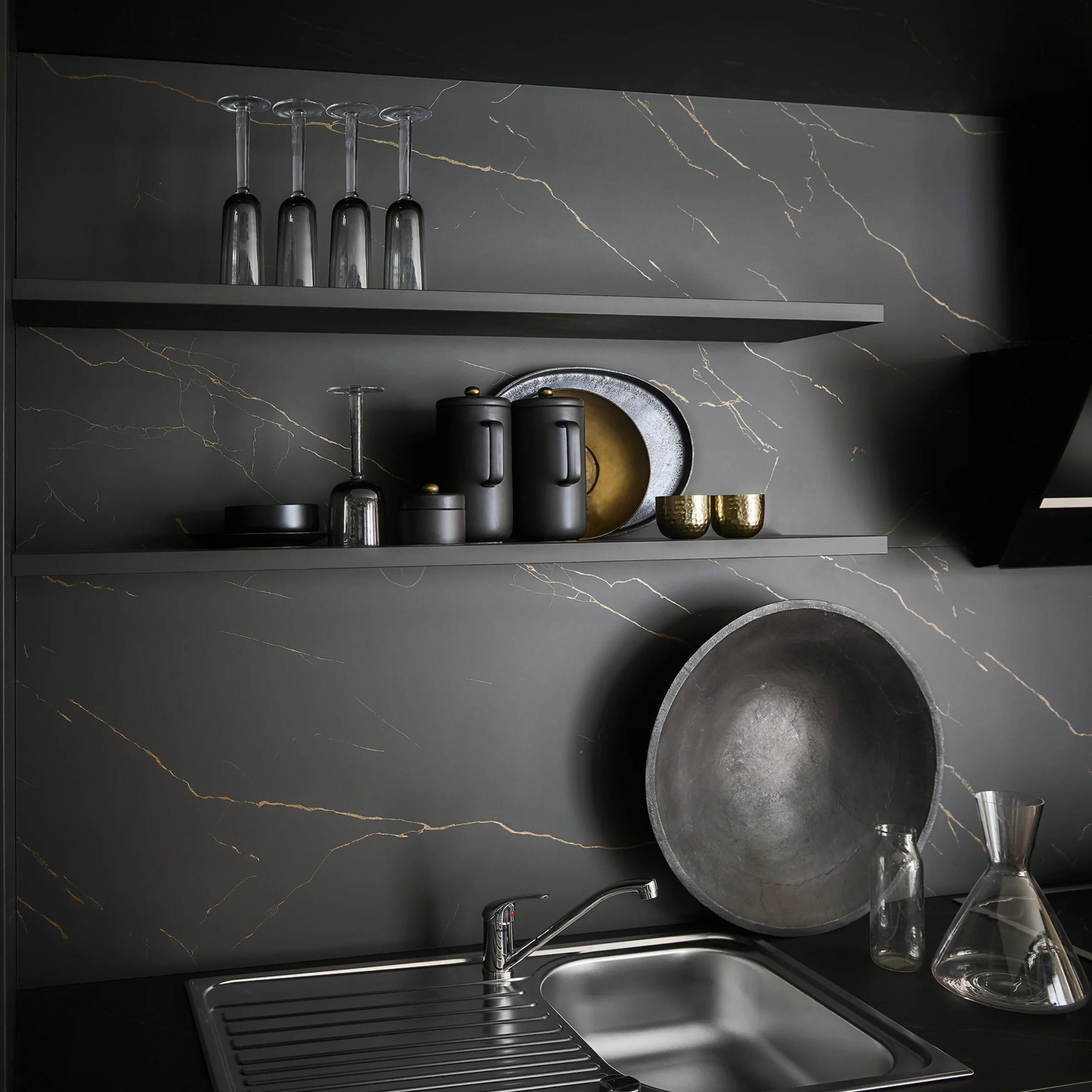
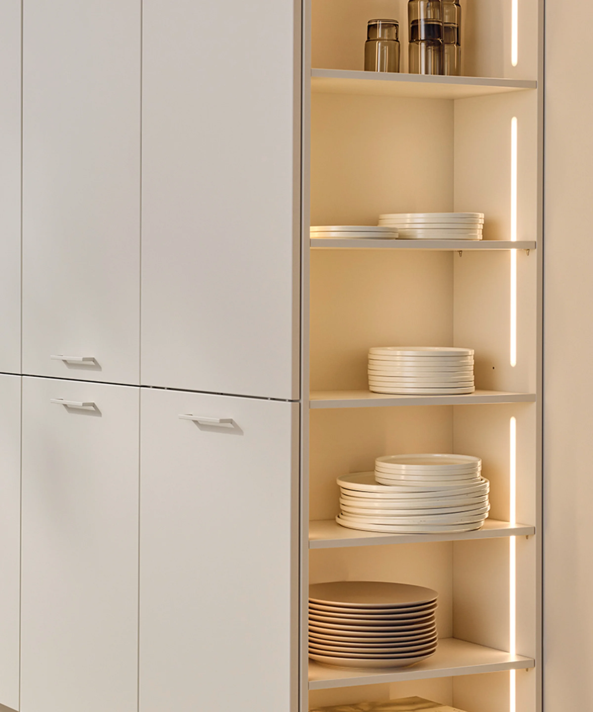
A tone-on-tone kitchen only reveals its full effect when all elements are consistently coordinated. In addition to the color of the furniture, wall color, handles, and materials play a key role. Matte surfaces enhance the homogeneous look and emphasize the high-quality appearance.
Key design elements:
- Kitchen fronts in matte, calm colors
- Wall colors that match the front color or vary slightly
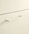
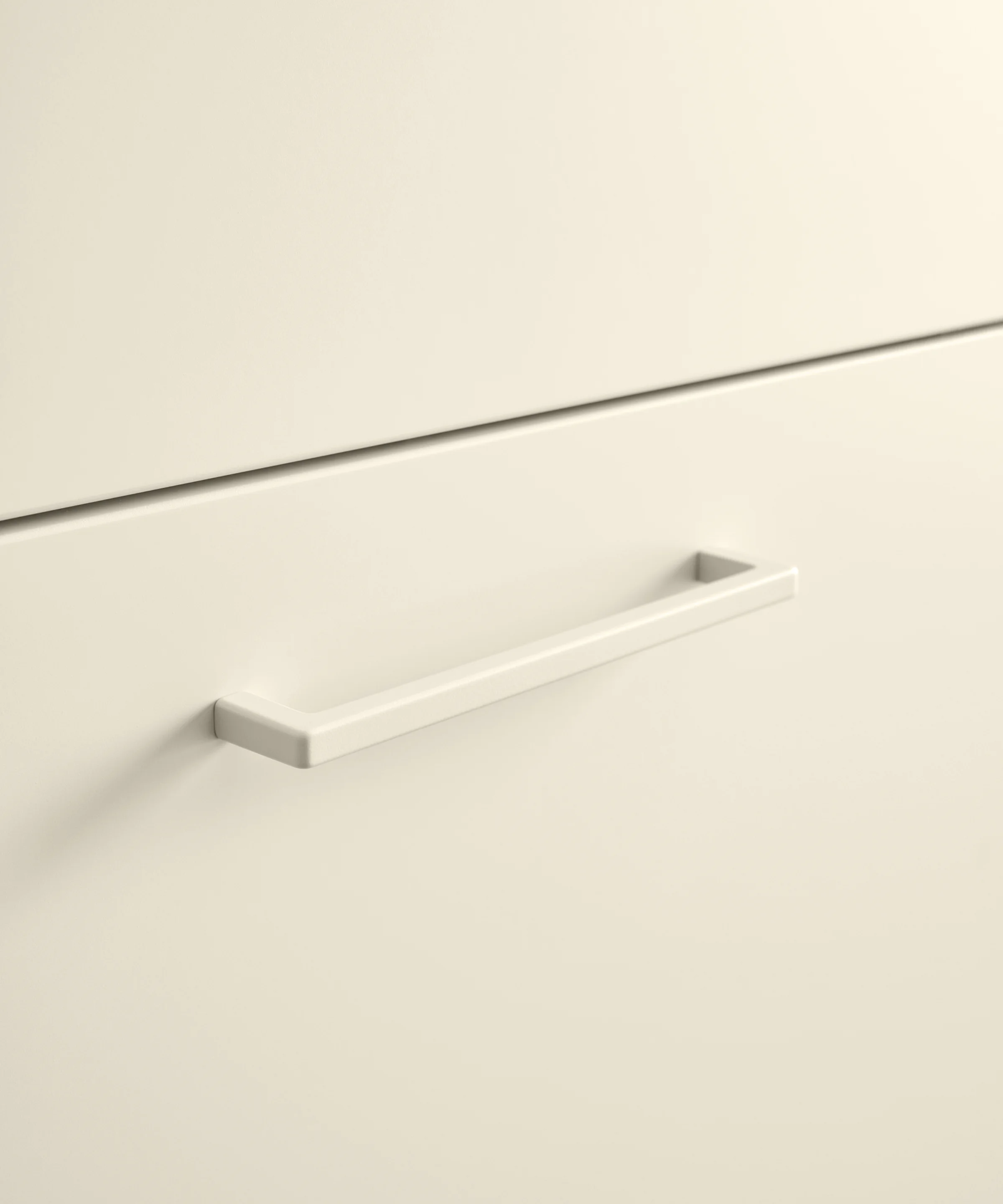
- Handles and details in subtle colors
- Materials that create texture without disrupting the color scheme
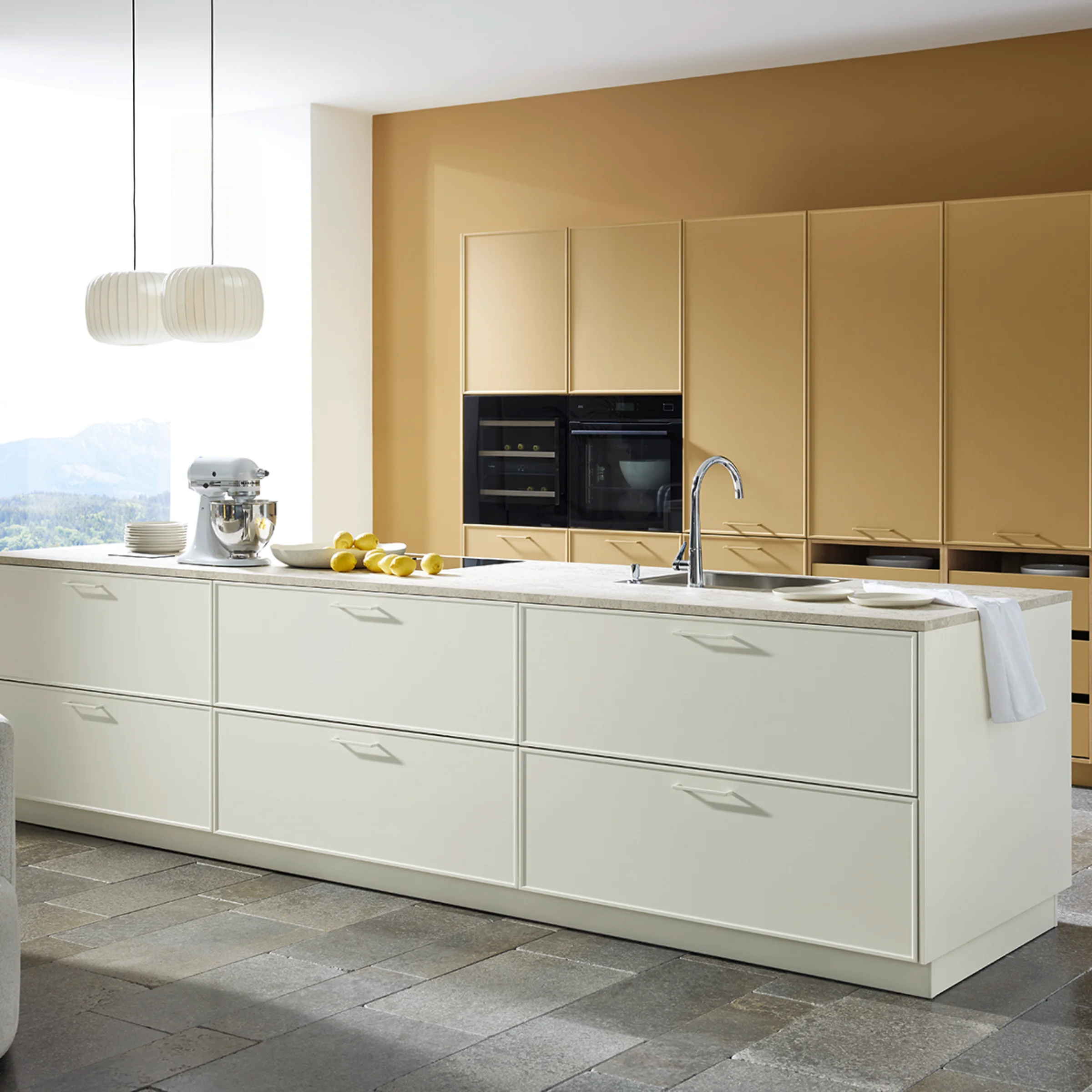
The matte lacquer concept from Nolte Kitchens: tone-on-tone with a holistic approach
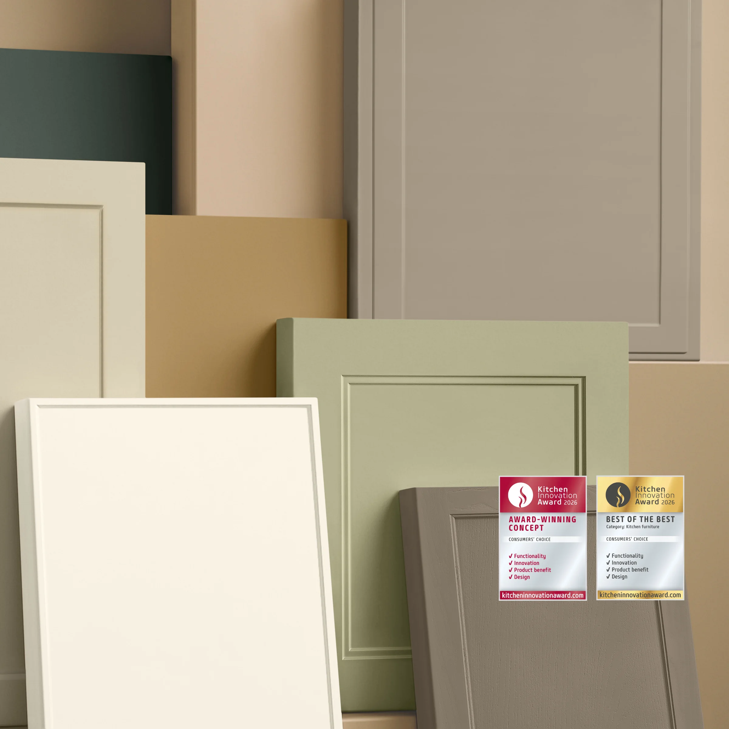
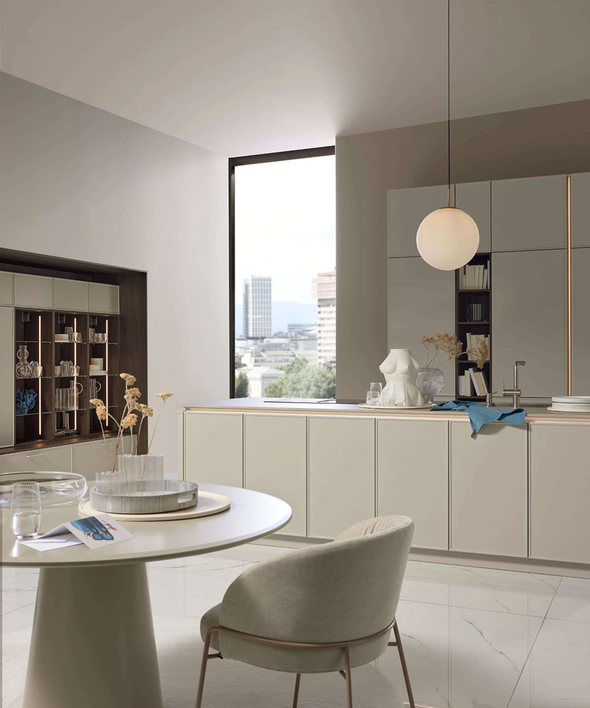
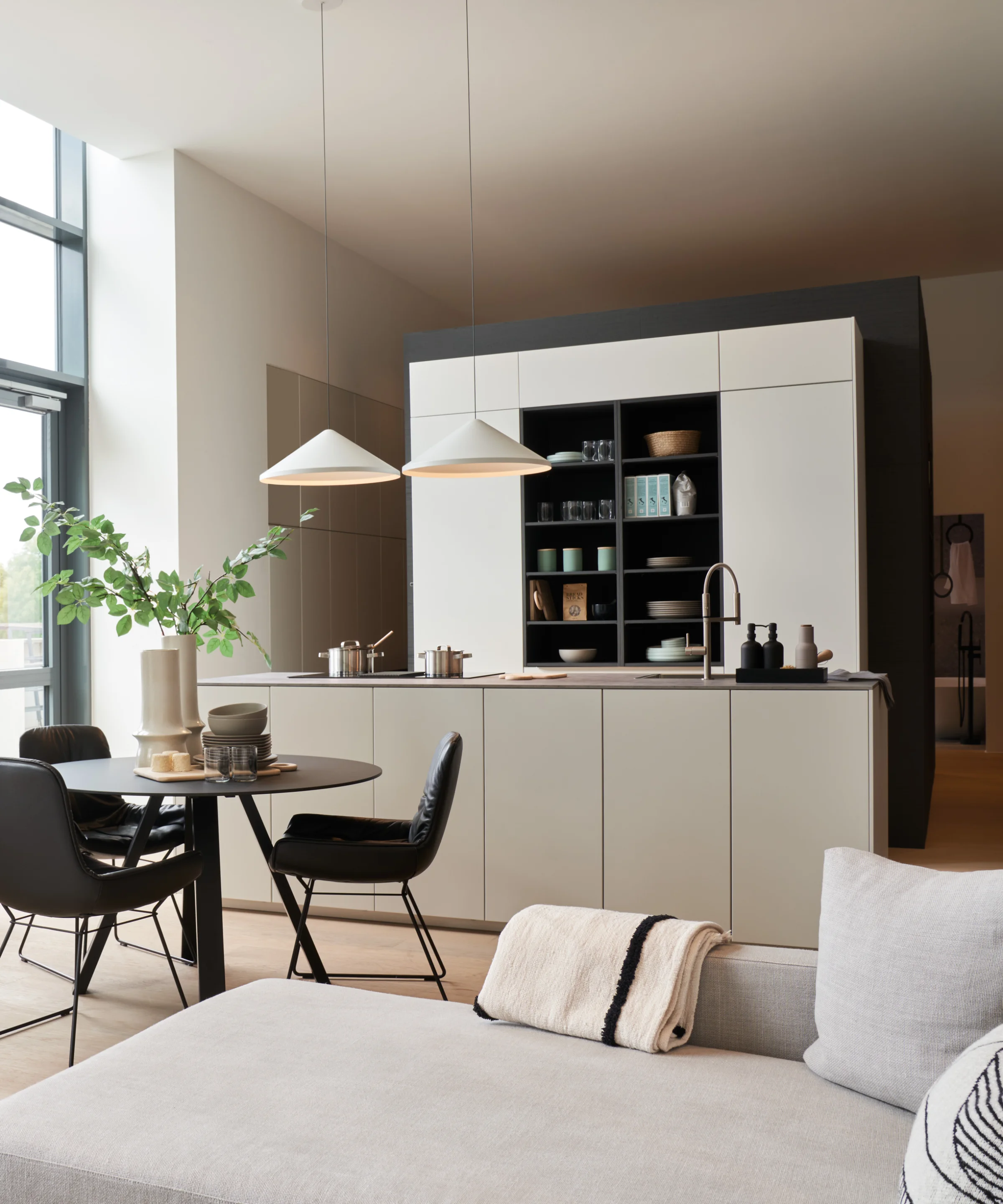
With the matt lacquer concept from Nolte Küchen, tone-on-tone is implemented holistically for the first time. Kitchen fronts, wall paint, and matching front handles are available in exactly the same color. This creates a particularly harmonious kitchen design without any stylistic inconsistencies.
This consistent design approach was honoured with the Kitchen Innovation Award 2026, highlighting the innovative strength of the concept.
The advantages of the matt lacquer concept:
- Uniform color scheme for kitchen fronts, walls, and handles
- High-quality, matte lacquer surfaces
- Ideal for modern and minimalist kitchens
- Particularly suitable for open-plan kitchens


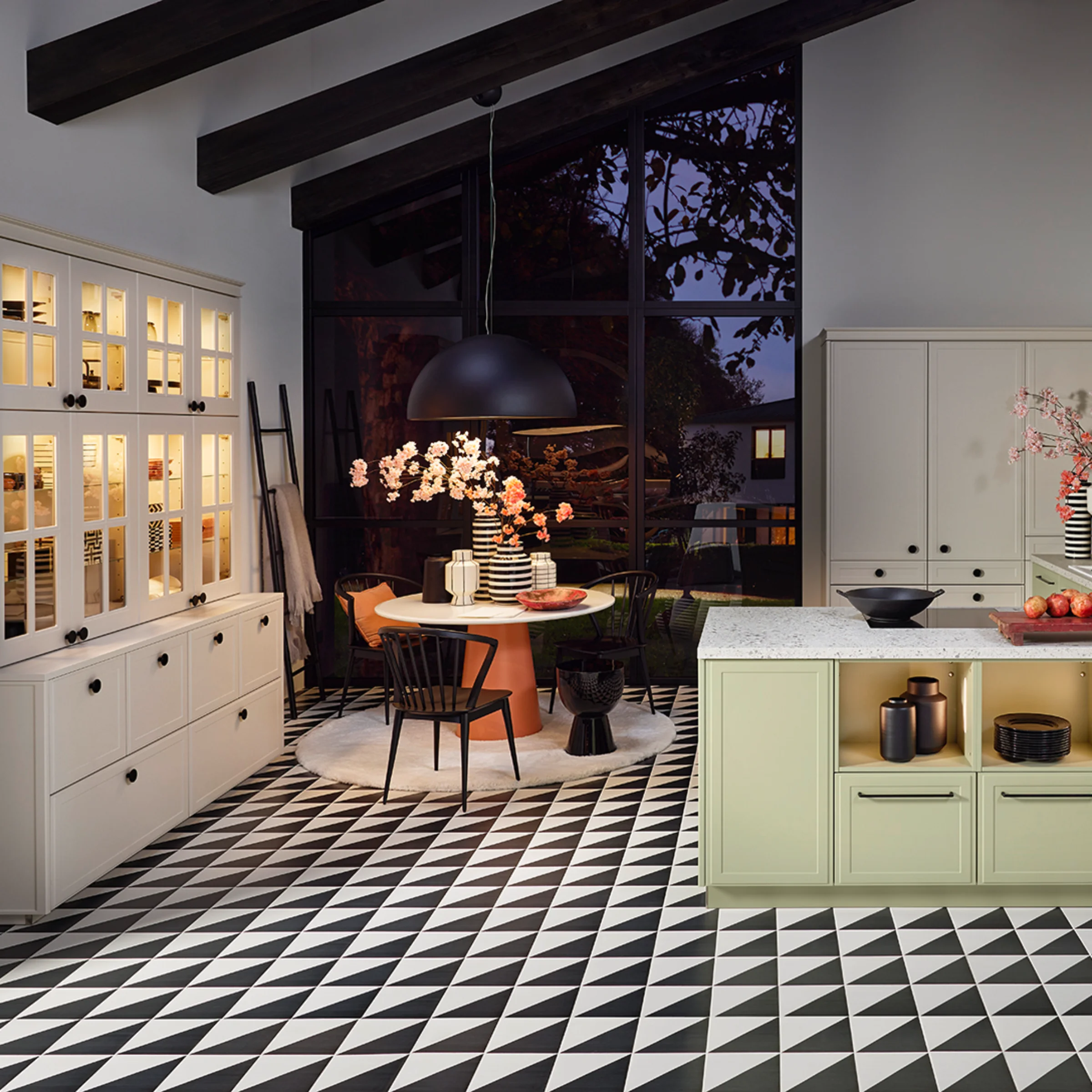
Popular colors for tone-on-tone kitchens
Tone-on-tone kitchens can be implemented in almost any color scheme. Natural, understated tones that blend harmoniously into different interior styles are particularly popular.
Popular tone-on-tone kitchen colors:
- Beige, sand, and greige tones
- Gray and stone shades
- Sage green and muted green tones
- Cream white and warm off-white colors
These colors have a timeless appeal and can be combined perfectly with wood, stone, or ceramic surfaces.
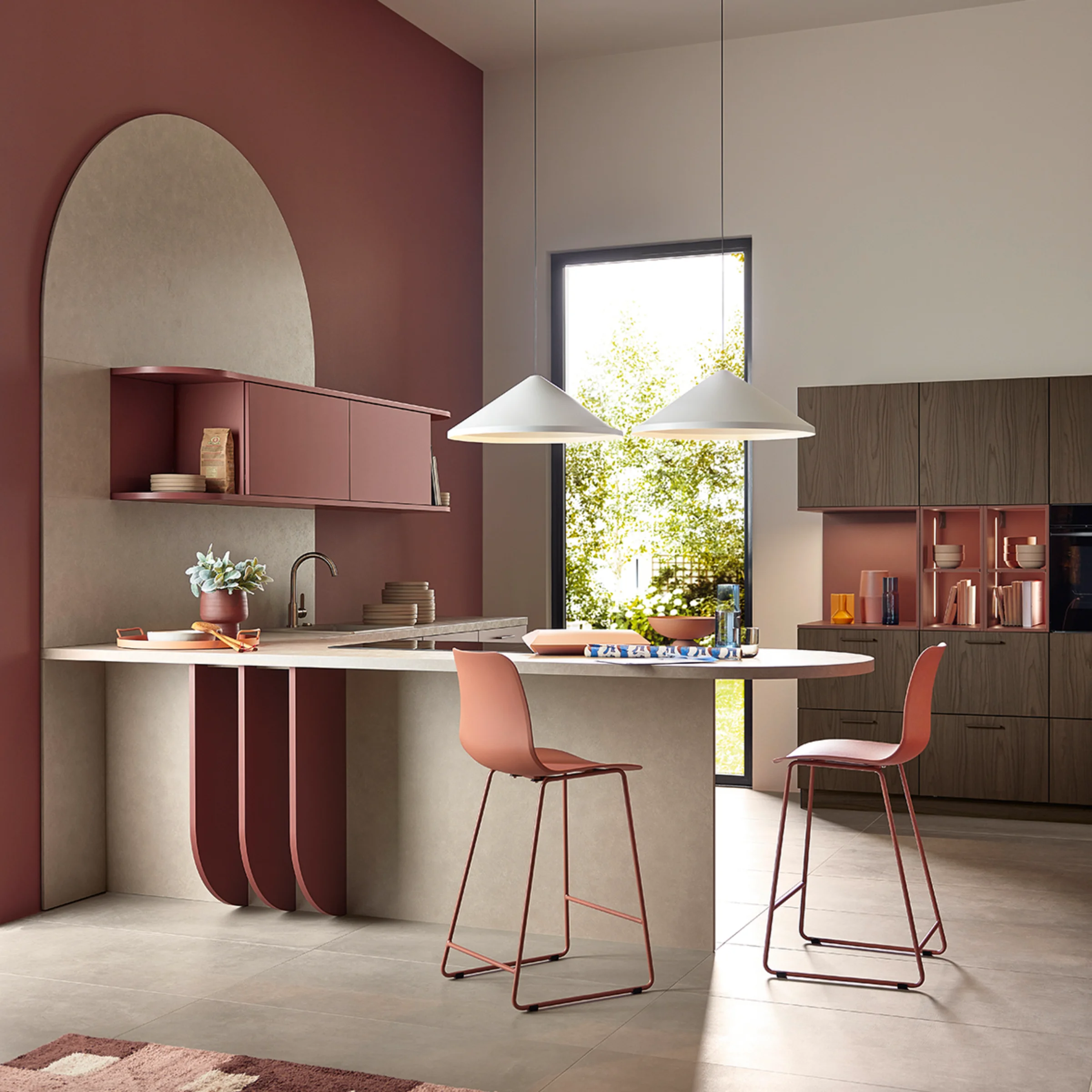
View tone-on-tone kitchens in the context of the room
In open floor plans in particular, it is advisable to consider the kitchen as part of the overall living concept. Tone-on-tone supports a harmonious transition between the kitchen, dining, and living areas. If the kitchen color is repeated in the wall design of adjacent rooms, a harmonious overall picture is created.
Typical areas of application:
• Open-plan kitchens
• Kitchens with a smooth transition to the dining area
• Modern new buildings and apartments
Typical areas of application:
• Open-plan kitchens
• Kitchens with a smooth transition to the dining area
• Modern new buildings and apartments

How to: Easily achieve tone-on-tone
Small changes for greater harmony
Tone-on-tone doesn't have to start with new furniture. Even a few targeted adjustments can bring more calm and structure to your living space. The basis for this is a clear design principle: concentrate color rather than spreading it around.
How to implement tone-on-tone step by step
Small, interchangeable elements make it particularly easy to achieve a tone-on-tone look – without any great effort.
Reduce visible color mixing
- Consciously remove colorful kitchen utensils, textiles, or decorations
- Critically examine individual items that are openly displayed
Replace accessories as needed
- Replacement with elements within a common color scheme
- Preferably use matte, calm surfaces
- Combine materials such as ceramic, wood, or glass
Stay within one color
- A color tone as a basis
- Designing nuances using light-dark gradations
- Setting accents exclusively through materials
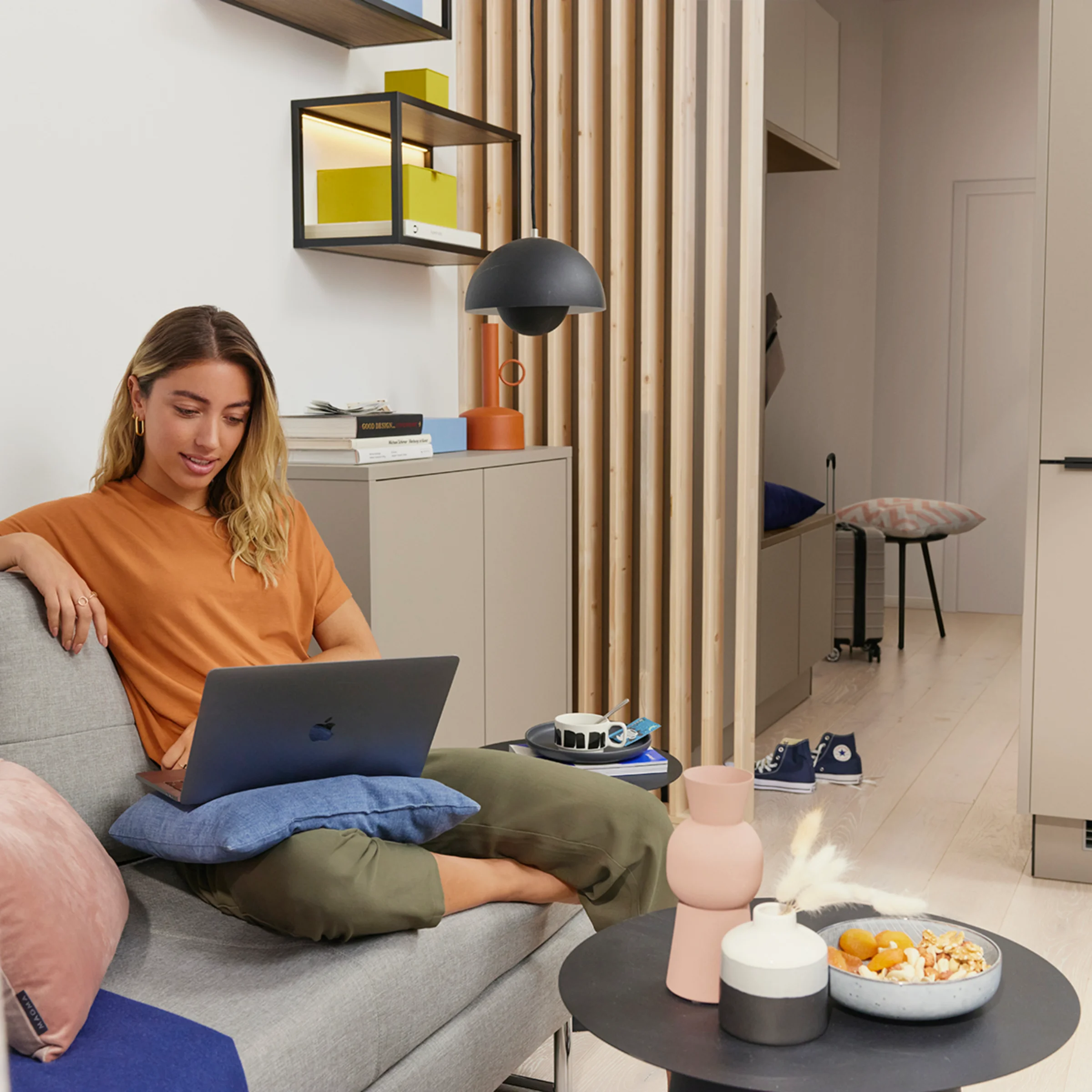
Examples of different living areas
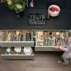
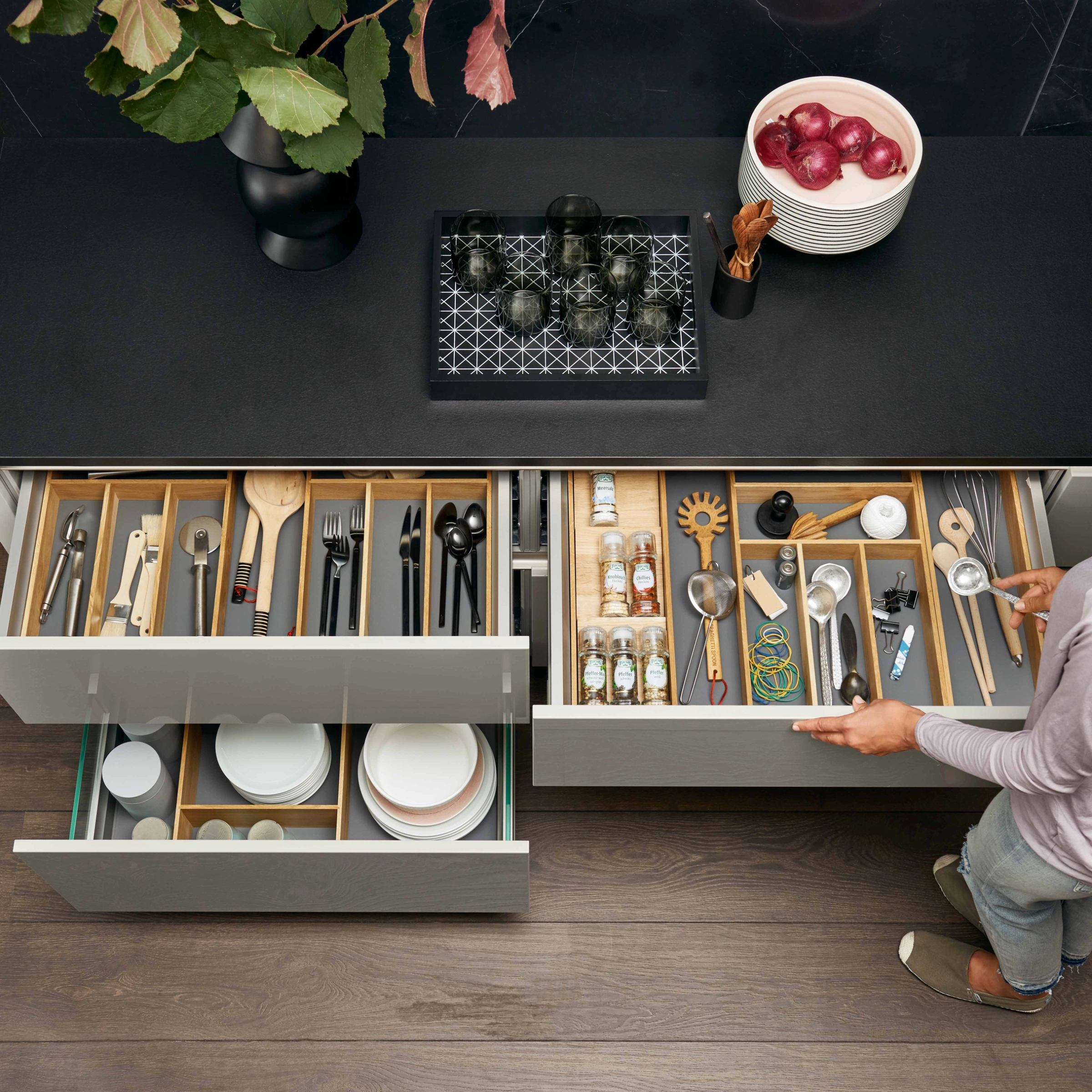
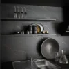
In the kitchen:
• Tableware, storage jars, towels, and cutting boards in a color scheme
• Calm overall effect despite functional diversity
In the living room:
• Pillows, blankets, candles, and picture frames in graduated shades
• More depth in the room without visual unrest
• Tableware, storage jars, towels, and cutting boards in a color scheme
• Calm overall effect despite functional diversity
In the living room:
• Pillows, blankets, candles, and picture frames in graduated shades
• More depth in the room without visual unrest


The result
- More structure and tranquility in the room
- Harmonious, timeless overall appearance
- Flexible implementation without replacing furniture
This is how tone-on-tone can be established step by step—as a conscious design element for kitchens, living rooms, and adjoining living areas.
FAQs: Frequently asked questions about tone-on-tone kitchens
Conclusion: Tone-on-tone kitchens as a timeless design concept
Tone-on-tone is more than just a short-term trend. It is a well-thought-out design concept for durable kitchens. With its matt lacquer concept, Nolte Küchen offers a unique opportunity to use color holistically and harmoniously combine the kitchen and living space.
Even more inspiration for your home
Whether it's the kitchen, utility room, living room, or bathroom—well-thought-out design thrives on ideas, colors, and materials that fit together perfectly. Gather more inspiration for different living areas and discover a wide range of possibilities for a harmonious home.


Discover tips and tricks
Discover many more tips and tricks in the Nolte Magazin.